Let's Build!
E-Commerce & Pricing Page Validation
Product Design
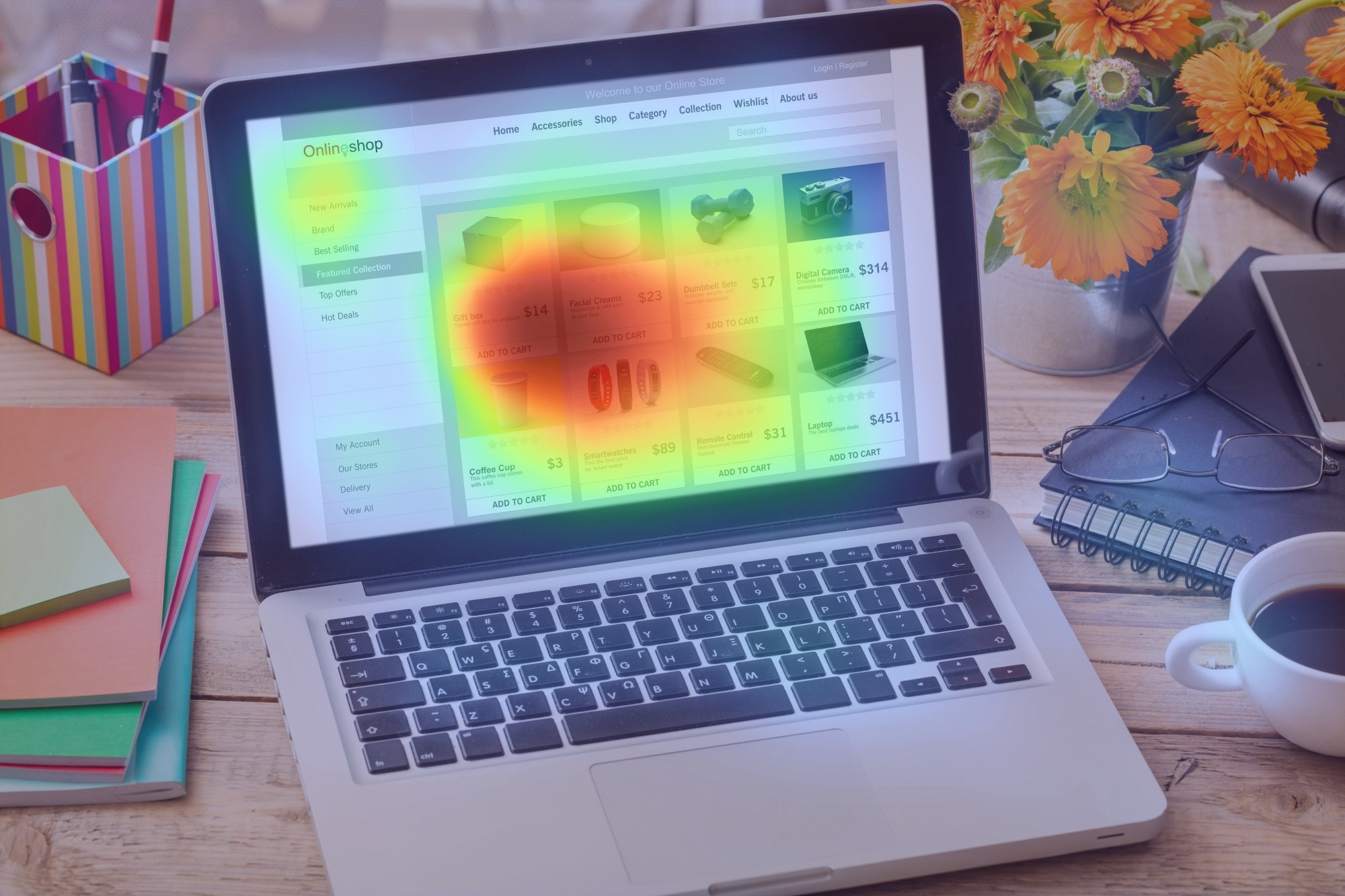
Pricing pages and checkout flows are critical to revenue. If users’ attention scatters across too many elements, decision-making slows and conversions drop.
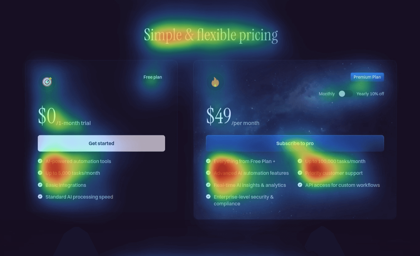
Challenge
The test examined whether pricing tiers, benefits, and checkout CTAs commanded enough attention, or if users were distracted by less important details.
Results
In some cases, attention split evenly across pricing tiers, diluting focus from the “recommended” option. Checkout CTAs competed with sidebar distractions. Recommendations included highlighting one tier as primary, increasing visual weight of checkout CTAs, and reducing visual noise.