Let's Build!
Hero Section Attention
App Design
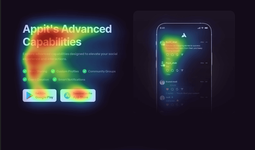
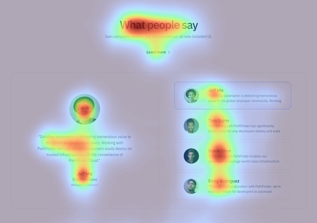
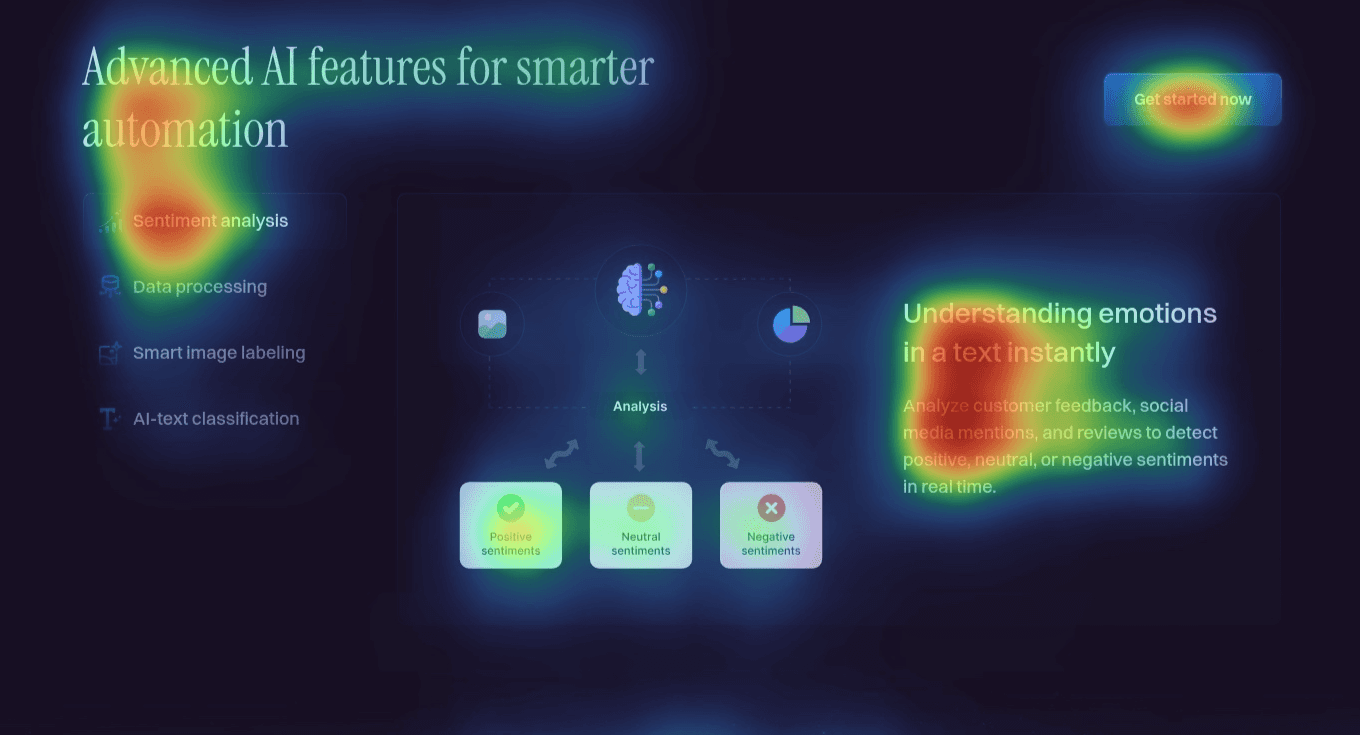
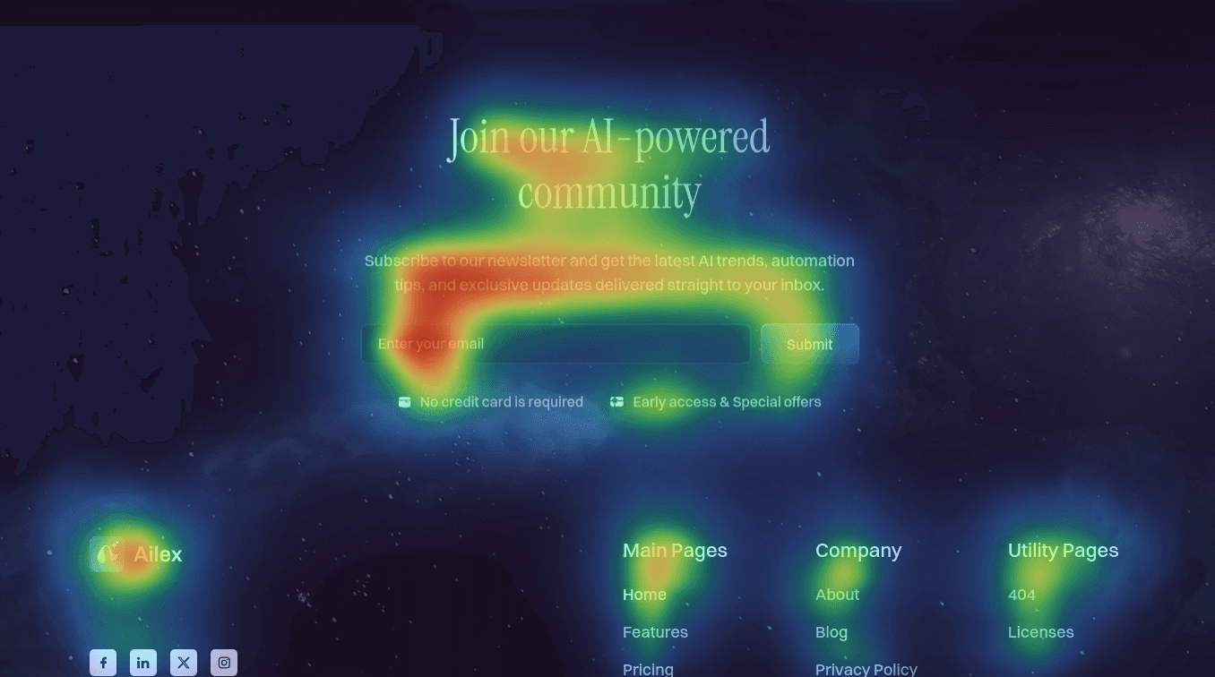
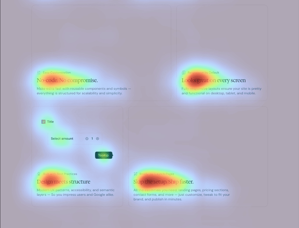
Hero sections are the first point of contact between a user and a brand. They must convey value quickly while guiding users toward a primary action.
Challenge
Headlines often dominate visual focus, but call-to-action buttons (the conversion drivers) risk being overlooked. The test here was to determine whether the hero layout prioritized the CTA effectively within the first few seconds of user interaction.
Results
Headlines absorbed more than 60% of gaze, while CTAs drew as little as 14%. Supporting imagery and navigation links further diluted attention. The recommendation was to reposition the primary CTA closer to the headline and increase visual contrast.